Before the first line of code is written, every website must answer the question of why? There must be conversations that ask, “Why is this website necessary? Could it be a page on another website?” Once the necessity of the website is established, the big question then becomes, “What should be displayed, and where should we display it?”
The why for the USF Libraries site is to provide easily accessible information to all of our patrons. This mindset is adopted by the front-end web developer (webmaster) and becomes the basis for all decision-making. Guided by the question of why, let’s look at this history, audiences, platforms, design, functionality, measurement, and maintenance of the USF Libraries website.
As with any website that has been online since the 1990s, the Libraries site design has undergone many revamps. Because of this, we will avoid criticizing simple “list of links” design from pre-2000, and pick up in 2006, with the old web standard of “narrow and small:”
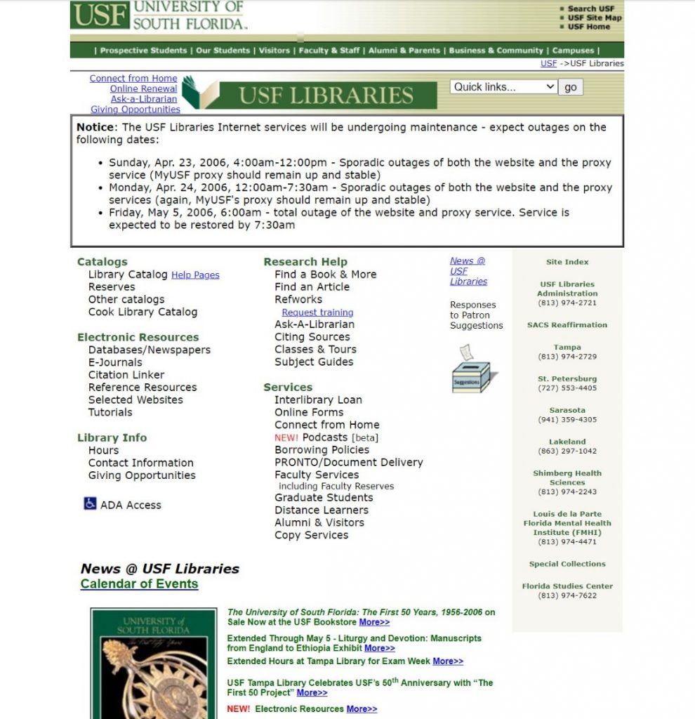
In the early designs of the website, lib.usf.edu looked like your typical mid-2000s layout. There was clearly an emphasis on core information, laid out plainly and simply. Overall, things were cramped and constricted, with the core essentials:
By 2012, more information was available through dropdown menus and the search options were more robust:
By 2016 the site included more emphasis on design and branding continuity:
By 2018, the site had undergone a full revamp with emphasis on device versatility:
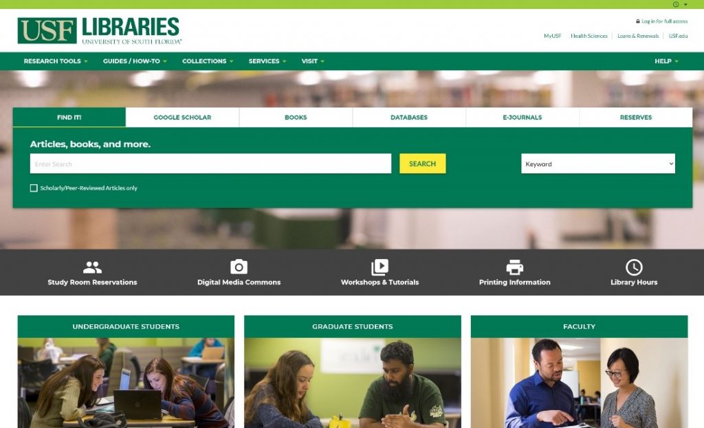
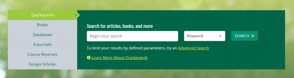
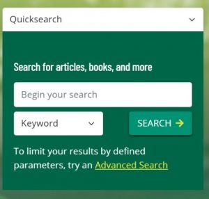
The current (2022) version of the website introduces new features, updated UI/UX, improved code methodologies, increased performance metrics, and includes more dynamic content:
There are an infinite number of ways to design a website. The spacing, layout, font selection, code framework, and required functionalities all must work together as a mechanism of information delivery. It needs to be a consistent experience, regardless of browser platform or device.
Like most websites, we built the Libraries site on an HTML/CSS/JS base. The Bootstrap front-end design system was integrated into WordPress as the content management system. This approach enabled the website to be fluid and easily updatable and maintainable for patrons. Each department has their own sub-site, where employees of that department can manage their own content.
With a solid code ecosystem in place, the focus naturally had to become how to display all of the available information to patrons, in this case USF students, faculty, staff, researchers, and the public. Since every end user comes to the site with a different need, there was extensive research and feedback for each webpage, including how to group and categorize them and how to display all the information avenues as simple and straightforward as possible.
With knowledge of how browsers typically use a website, we clustered information into groups which would ideally be most obvious to access. The goal is to make people think as little as possible, as opposed to having to dig and search for answers.
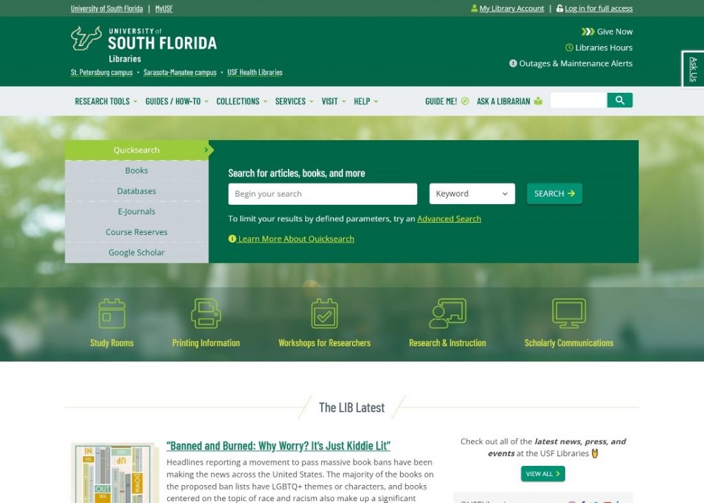
Based on established hierarchy and aesthetic dictated by the established USF brand, the header and footer navigations were built. Not only were these areas created to be primary information paths, but also to house tools to help patrons quickly find what they need. Since the libraries are popular physical spaces, open hours have been a top information request. To address this, we added a dynamically fed list of hours for all library buildings, which is located in the header of every page.
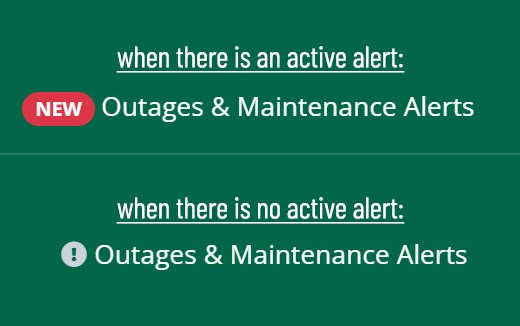
There are also occasional outages with third-party systems, particularly during maintenance periods. To help communicate this, we built an alert system to let patrons know when the problem they’re experiencing is not specific to them but an overall outage or maintenance related issue:
The homepage acts as a functionally hybrid brochure as well. If our patrons need to use the Libraries for its primary purpose, like to find written materials or multimedia for research, they will likely begin with the Search Box, which was developed to be simple and delightful using any device. This box includes methods for searching databases with input criteria, or browsing content by letters and popular titles.
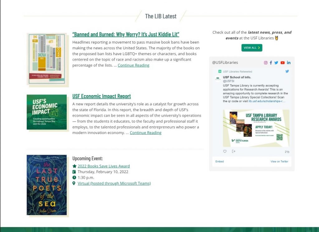
The homepage is also where we want to show the latest goings-on of the USF Libraries and give visitors the chance to connect with us across the web. The LIB Latest section features our Twitter feed, links to our profiles on various social platforms, and has a dynamic feed of our latest LIB News, which are all published by the Libraries Communications & Marketing team:
The rest of the homepage presents information clusters based on internal priorities and external information request hierarchy. With every design and layout decision, we had to establish a why, as to placement, grouping, priority, size, color, and variation.
The Libraries initiatives and services are displayed on the homepage, followed by most frequented information by classification of our patrons:
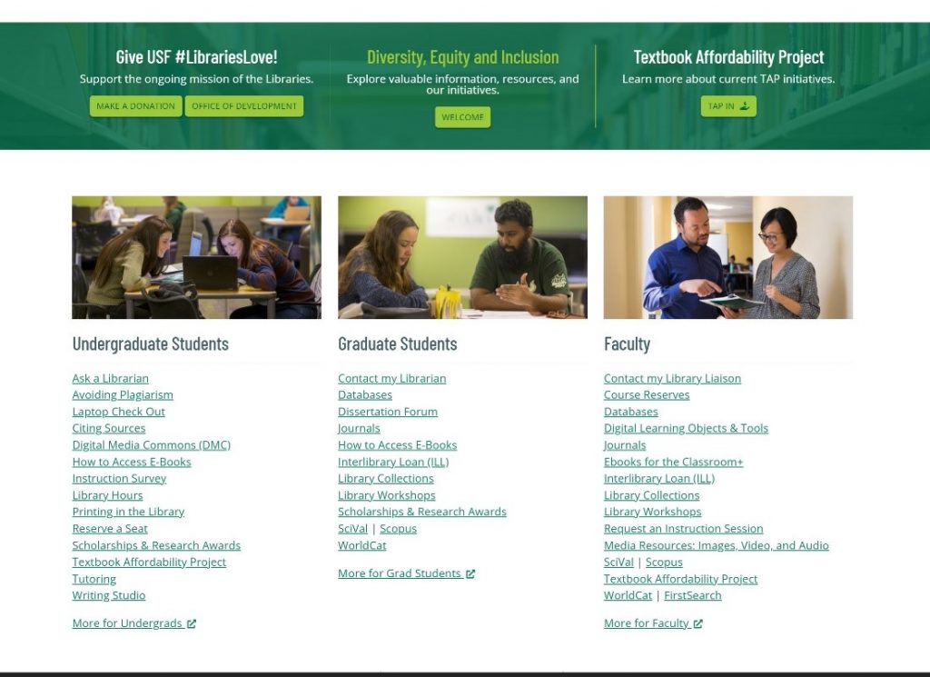
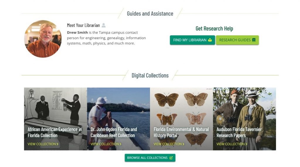
Guides and Assistance introduces librarians and links to relevant information for research help. Digital Collections are featured and periodically updated:
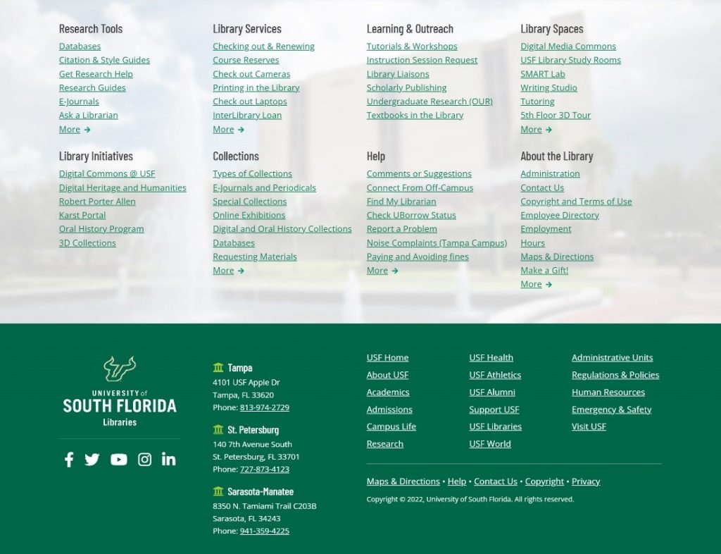
The footer is present on every page, and includes a large list of categorized links for anyone who may have not found what they are looking for by the end of a page scroll:
Even bigger than the look and feel of the site is performance. Load times and SEO have been optimized to create the best experience for patrons when discovering and previewing the Libraries site, and with a quick-loading, polished, clean, and responsive experience. For load times, we kept the file size of the site to a minimum, minified code, and optimized data delivery based on Lighthouse metrics reporting. Things like preview images, preview text, and meta information help our userbase when linking our site to a third party, benefiting in relevant and updated preview content.
Building a path of least resistance, creating a delightful experience, and making it all purposeful and useful for the full gamut of over 14K visitors per month, requires an ever changing, updating, and improving website. Since there’s a constant drive to improve the experiences for our audiences, we evaluate and reevaluate what’s being displayed, where, how, and most importantly, why.
Being guided by the persistent question of why helps keep the focus where it should be: USF students, faculty, researchers, and the general public. If you need assistance, let us know by using our chat feature and asking a librarian. We are here to help!